Role
As design lead I researched, designed and tested all UX & UI related to the project.
As design lead I researched, designed and tested all UX & UI related to the project.
Skills
Competitor analysis, user flows, user testing, wireframes, prototyping, presenting.
Competitor analysis, user flows, user testing, wireframes, prototyping, presenting.
Date
Oct 2019 - Jan 2020
Oct 2019 - Jan 2020
Problem
How can we create a product which allows users to pay their Wagamama bill on their phones without having to download a specific app, thus saving time and being convenient?
Design a fresh, intuitive mobile web application on Wagamama.com allowing users to benefit from paying online in a simple four-step process by enabling them to:
– Enter location / table number
– Check the bill
– Add an optional tip
– Pay and receive a receipt
– Check the bill
– Add an optional tip
– Pay and receive a receipt
User flow
A flow for the primary user goal was created to form a foundation for the project that met the client’s requirements, the technical constraints, and user entry points. Competitor analysis was also carried out, looking at web applications and mobile apps with similar products to pinpoint certain features that addressed issues well, and noted areas of improvement to aid our product.
Wireframes
To gain greater insight from a user’s perspective, I tested the product with five users. These were 1-2-1 environments where I asked the users to carry out different tasks with wireframe prototypes at various points throughout the project.
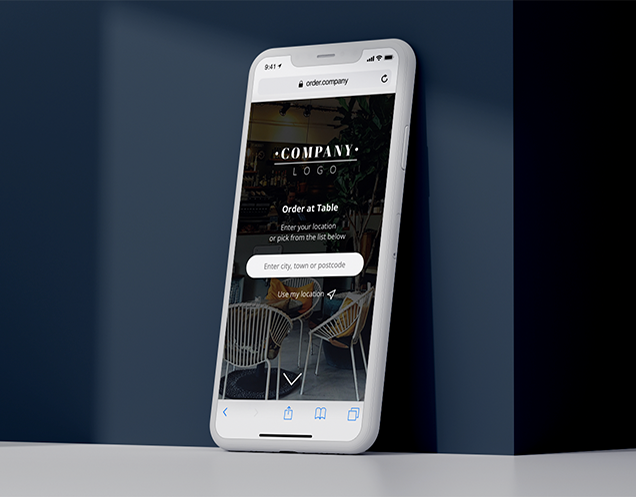
Through testing, it became evident that the journey had too many steps for the user to input their location and table number to receive their bill. So I simplified the journey by placing all input fields on the landing page. It also became clear that people were unsure about having an automatic search and geo-locate search in the same field, so these were split into two different search options.
UI design
Medium-fidelity prototypes were developed to test with users, and present the Pay At Table product to the client and branding agency. For the UI to fully align to the functionalities of the UX, changes were made in collaboration with the agency to improve the product overall before it went into the development phase.
The Results
Pay At Table was first introduced in five restaurants which, due to its success and high engagement, was immediately rolled out to restaurants nationwide. Pay At Table now processes over 80,000 weekly transactions for Wagamama.
The whole project was a huge learning experience. I especially enjoyed iterating on designs and testing the designs on users to form the best possible product. The feedback helped improve the design for a more seamless and intuitive experience. I also enjoyed collaborating with the development team in the office and remotely, learning more about the product’s infrastructure, its integrations, and discussing animations that could use to bring the product to life.
Image: Wagamama


