Role
As UX design lead I researched, designed and tested the product.
As UX design lead I researched, designed and tested the product.
Skills
Competitor analysis, user flows, user testing, low to high-fidelity wireframes.
Competitor analysis, user flows, user testing, low to high-fidelity wireframes.
Date
2020
2020
Problem
How do we create a user-friendly, frictionless product that serves a wide range of hospitality and leisure clients, keeping users safe and able to social distance when ordering?
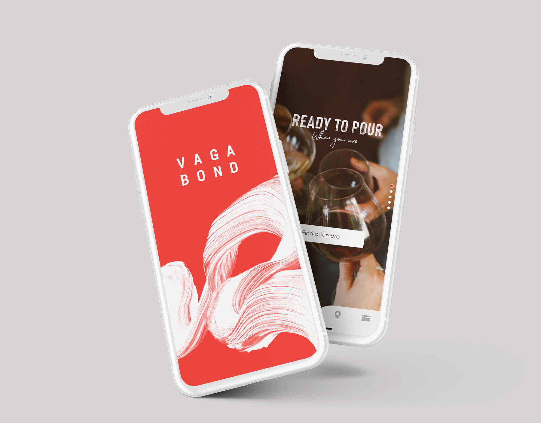
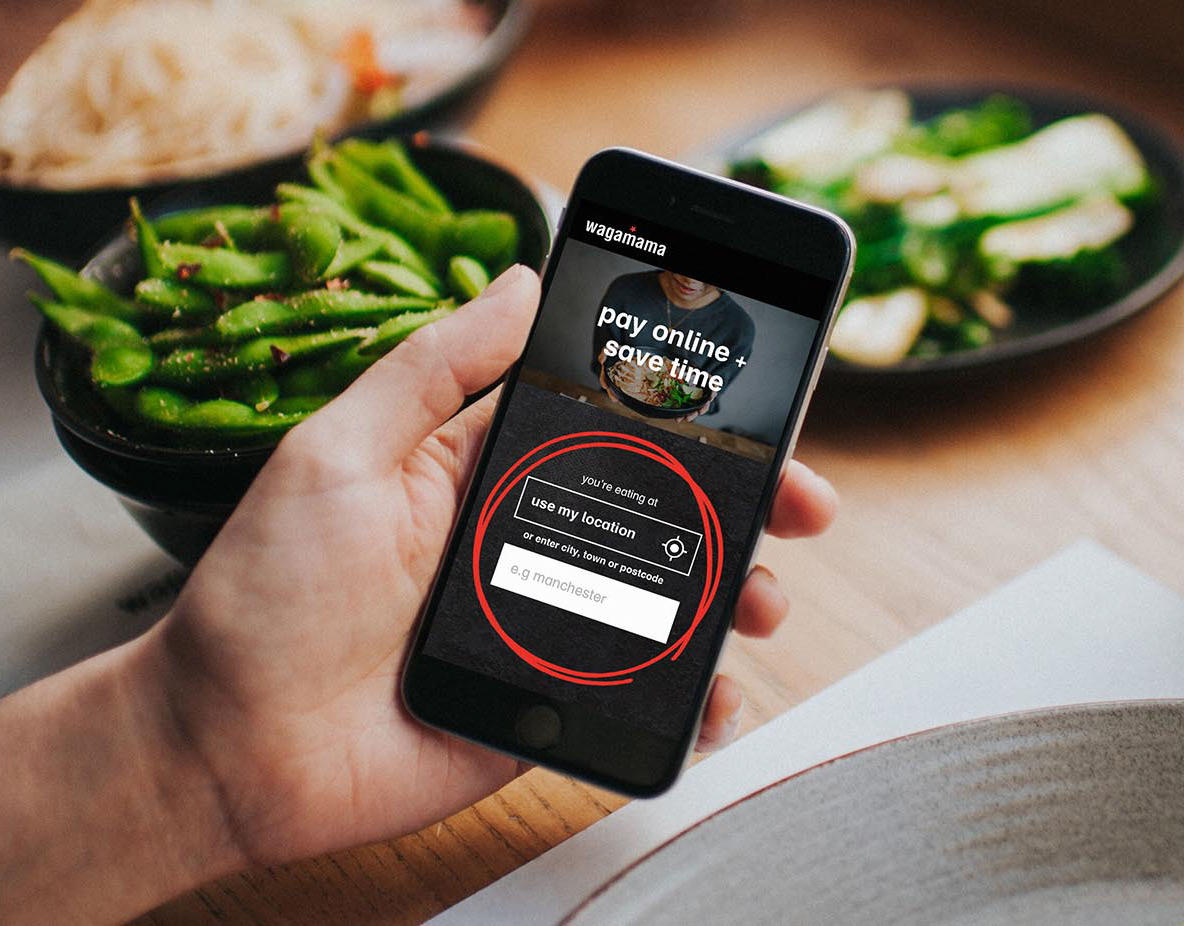
Introduce Order At Table, a whitelabel webapp that serves the user seamlessly and intuitively, allowing the user to find venues, order items and pay, as well as helping businesses operate safely. This product is also fully customisable for each merchant, enabling them to change:
– URL / QR Code link
– Tone of voice, branding and fonts
– Menus
– Images
– T&Cs and allergens links
– Tone of voice, branding and fonts
– Menus
– Images
– T&Cs and allergens links
Process flow
In response to global business needs, Order At Table was created under pressing time constraints. Being aware of this, and to maximise the product development, I continuously reiterated the flow and wireframes, asking the wider in-house team to explore pain points and test features in order to improve the overall user experience.
By doing this I found that two user entry points were needed to support wide-ranging clients who have single or multiple venues. I also found that less steps were required in the journey than originally thought, as people were happy to scroll on one page to view their basket, tips and the discount code feature rather than tapping through multiple pages, and thus these were combined.
Early Wireframe Development
Working closely with the frontend and backend developers, it became apparent that two design variations were needed to accommodate the two different order management API integrations, as the data provided by each API at each step of the journey differed. Therefore, the designs were developed to contain similar information whilst delivering a seamless journey.
High-Fidelity Wireframes
Order At Table is a flexible product that allows for any merchant to apply their tone of voice and branding, including typography. For the build to become fully adaptable, I produced a theme for the developers outlining primary and secondary elements in the colour palettes, button states and adjustable line-heights as well as functionalities to turn tips and discount codes on and off. The theme was also adapted to aid the clients in customising their product and to ease their on-boarding experience with the CMS.
Multiple Venue Journey
UX Design Variation One (API Dependant)
UX Design Variation Two (API Dependant)
Basket & Checkout Journey
The Results
Order At Table is used in more than 700 venues across the UK by clients including Fullers, Beds & Bars, The Alchemist, Thwaites, Hippo Inns, Loungers and many more. Order & Pay can also be found in Paris, Barcelona, Amsterdam and Berlin.
Since going live on 4th July 2020, it has processed over £15 million in revenue for clients to date (as at 1st Sept 2020), while helping businesses to operate safely, especially during the flurry of activity brought about by the government’s ‘Eat Out to Help Out’ scheme.


