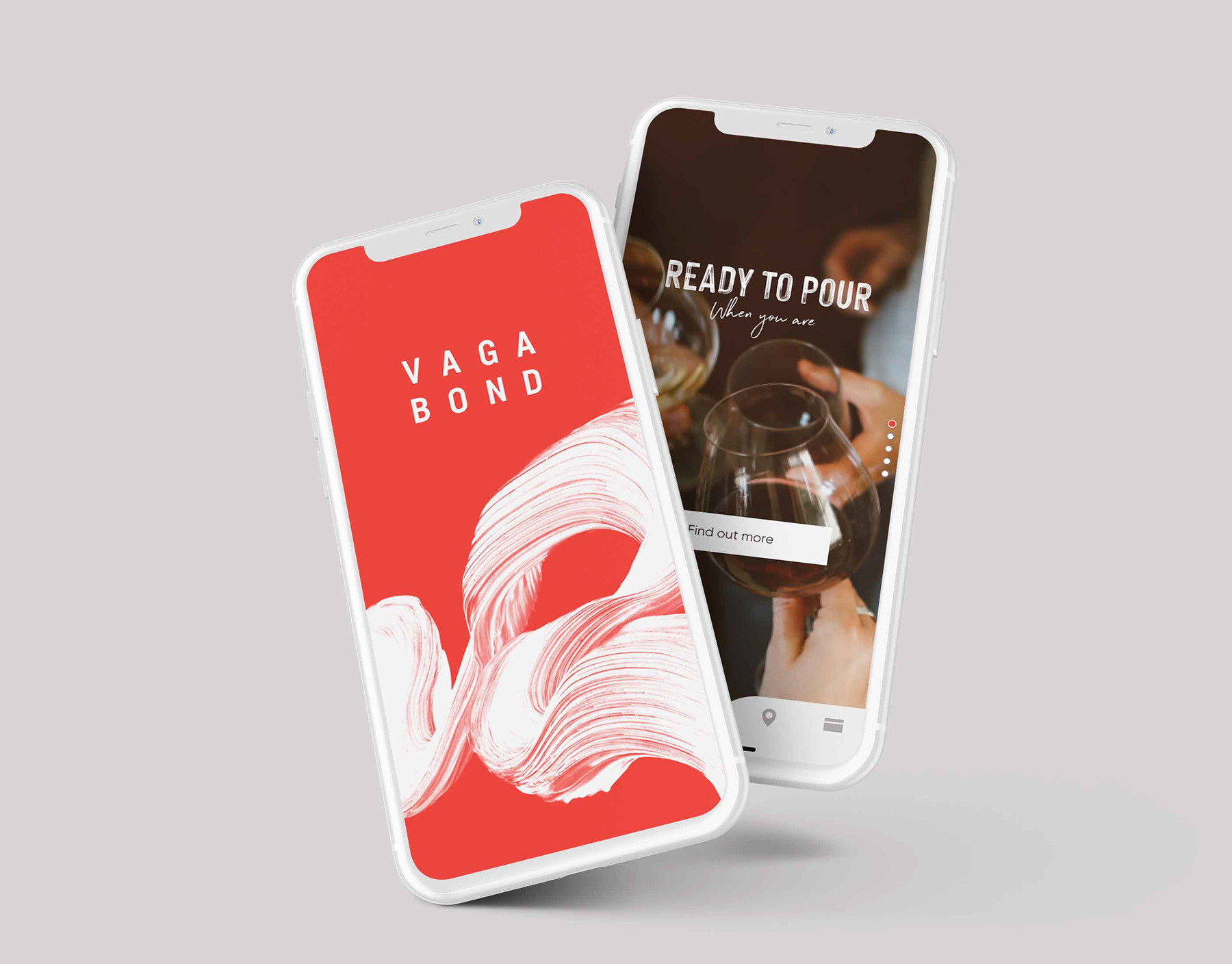
Role
Team project working with the Creative Director.
Skills
User flows, wireframes, testing, design direction.
Date
Jan 2019 - Mar 2019
Team project working with the Creative Director.
Skills
User flows, wireframes, testing, design direction.
Date
Jan 2019 - Mar 2019
Problem
How do we create in-store digital content for the Oxford Street flagship store which is engaging, interactive and relevant?
Design an interactive screen that allows OFFICE to present a seamless and unique campaign messaging in store which features staff who provide shoppers with a personal service. The content utilises flexible templates, meaning it can be refreshed and updated instantly. OFFICE can also monitor effectiveness of campaigns and so the display always remains relevant.
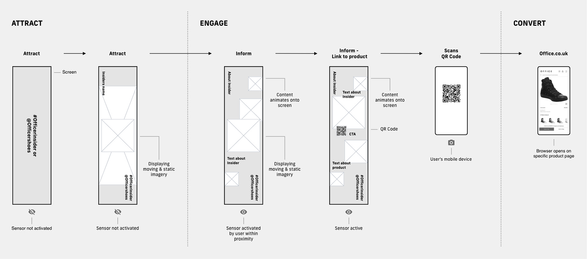
Wireframes & Flow
Working in an agile manner, we quickly established the user flow. I created wireframes based on the user flow, visualising each stage of the journey and how the user would interact with the screen. This became an Attract, Engage and Convert journey which also involved a sensor below the screen. If no-one is in the proximity of it, an ‘Attract’ screen will display. Once someone is in range, it reveals ‘Engage’ screens playing on a loop. A QR code appears on the final screen which the user scans to purchase the product featured in the style guides created by the OFFICE staff.
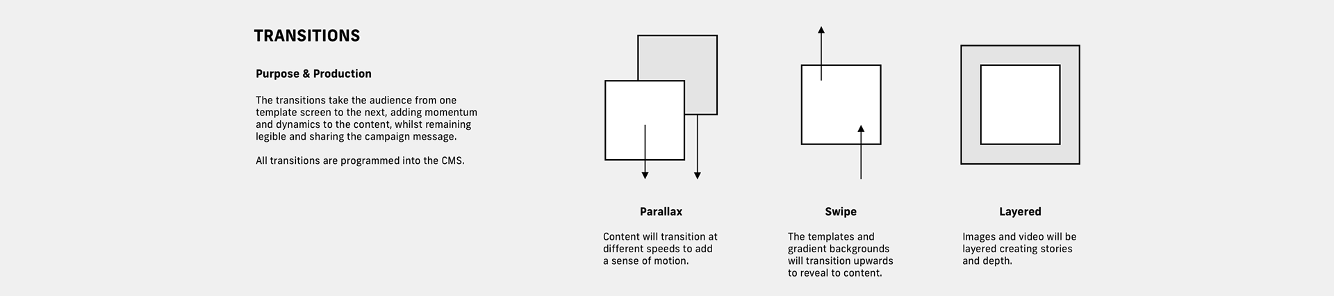
To create a more dynamic feature, we established three transition types, Parallax, Swipe and Layered, that the development team coded into the CMS. These transitions worked in synchronisation to display changing content between the screens.
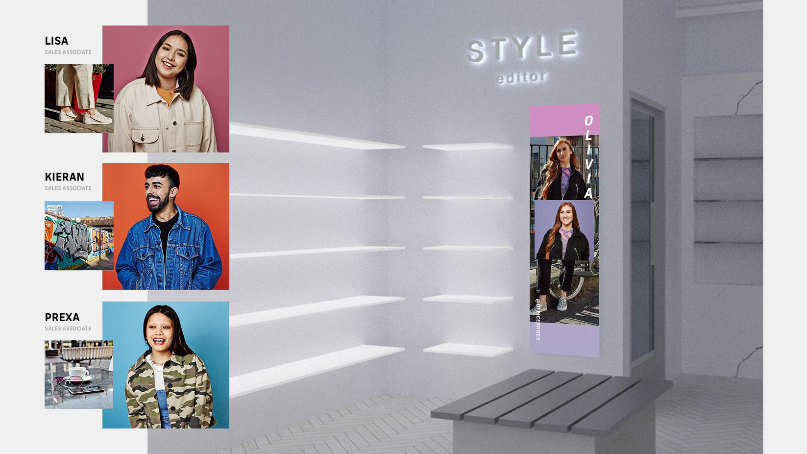
In-stu mock-up
The screen was tested continuously to improve the product from low to high fidelity, using paper prototypes and masking tape to check the scale of the screen and design elements. This enabled us to establish the best possible location for the QR code, ensuring it was at the right height to be accessible. We set up screens and tested the product throughout each sprint, adding more and more content to establish technical limitations for file sizing and dimensions. This ensured that the OFFICE design team had ample information to refer to when creating new content.
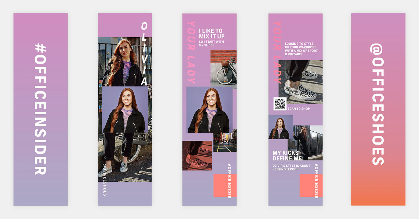
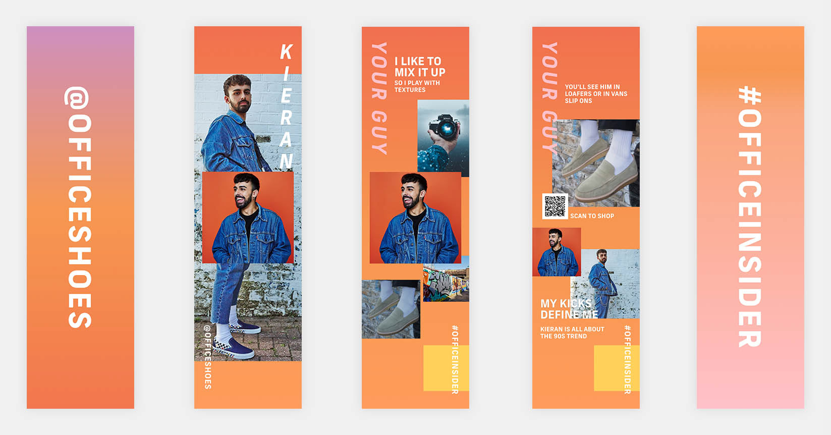
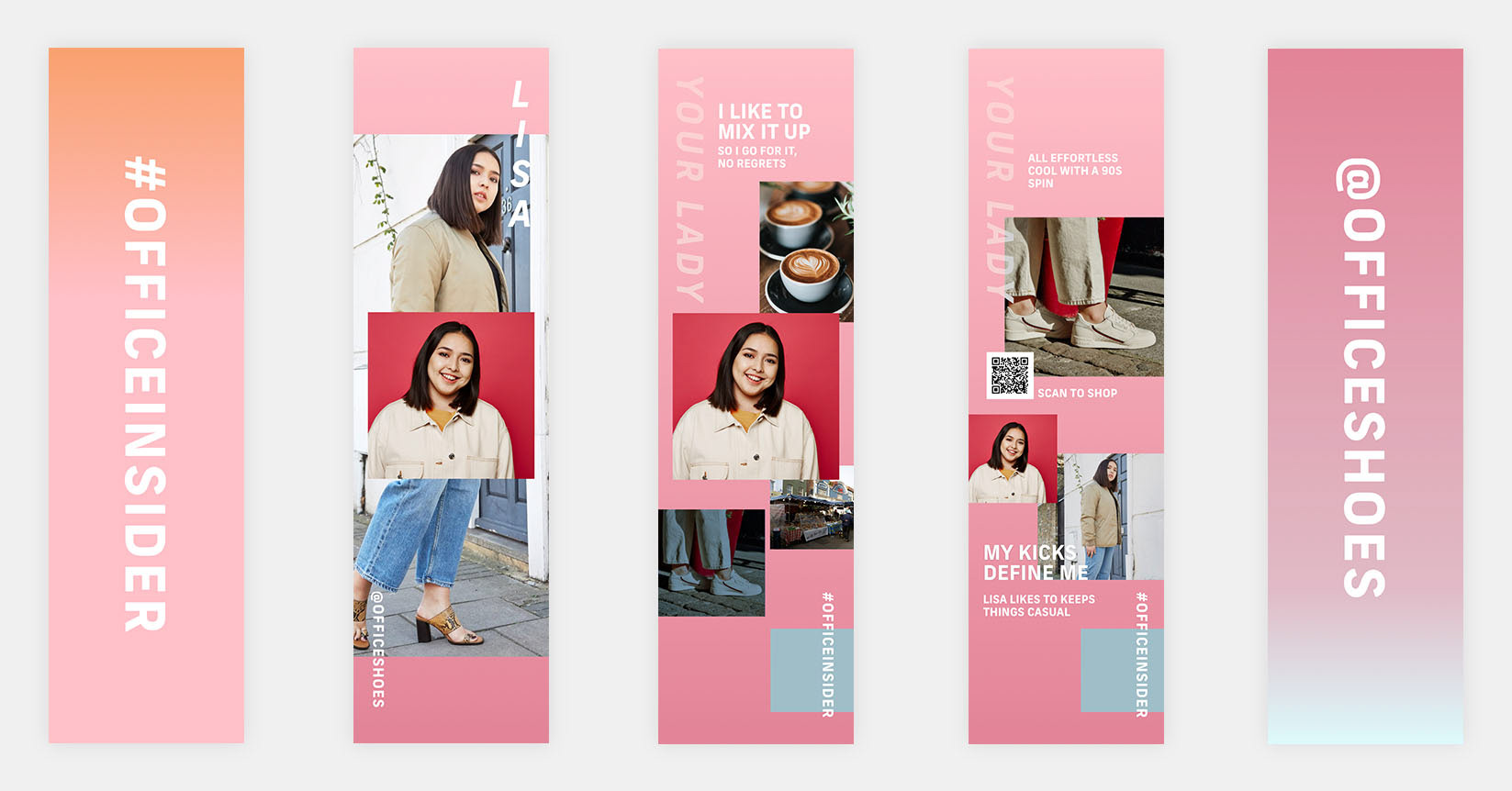
UI for mains screens within journey
OFFICE Oxford Street is a premium, sleek setting with a playful yet personal edge. This inspired our designs as we explored the concept for each screen, focusing on the models’ favourite shoes and elements of their lifestyle to allow the user to relate to the content on the screen as they discovered more about the product. The colour palettes were chosen to be in sync with wider campaigns and stemmed from the Spring/Summer collection, using varying shades to form bold gradients for a fresh look.
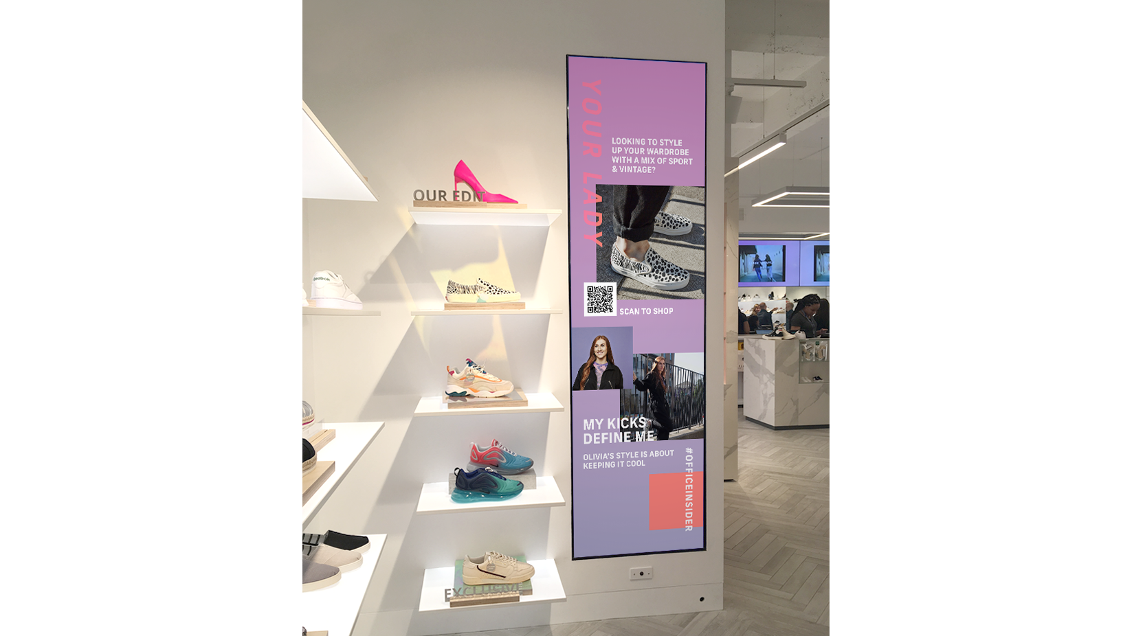
Photo of in-store screen
Learnings
Moving quickly and agilely through the process is essential to working closely with key stakeholders and solving any pain points. This allowed us to deliver the project within a short time frame. The screen continues to deliver dynamic content in the OFFICE Oxford Street flagship store.
In future projects, I would pair font colours with the main palette so the client can seamlessly produce content that keeps the design consistent and to ensure optimal legibility.
In future projects, I would pair font colours with the main palette so the client can seamlessly produce content that keeps the design consistent and to ensure optimal legibility.
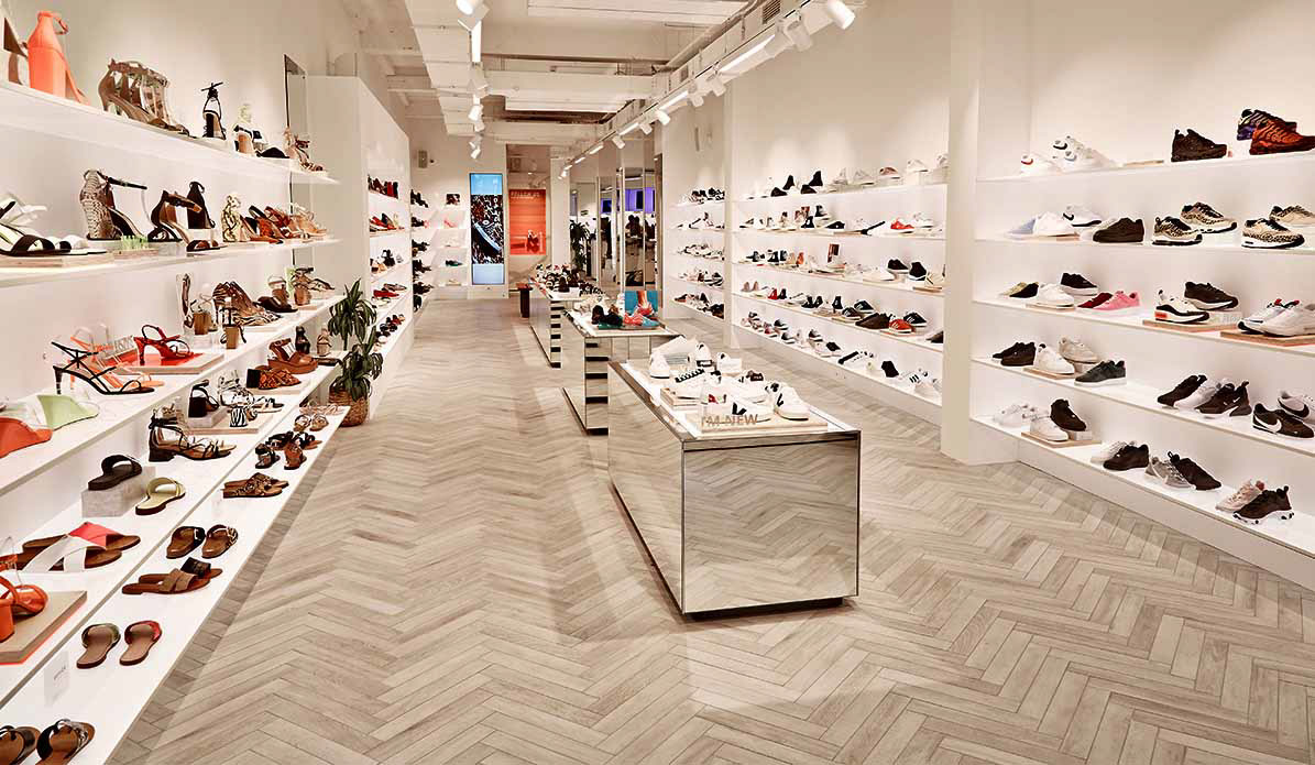
Photo: Office.co.uk