Role
As design lead for the project, I researched all UX and redesigned all UI as well as presented all changes to the client.
As design lead for the project, I researched all UX and redesigned all UI as well as presented all changes to the client.
Skills
Competitor analysis, user testing, wireframes, prototyping, presenting.
Competitor analysis, user testing, wireframes, prototyping, presenting.
Duration
Jan 2019 - Mar 2019
Jan 2019 - Mar 2019
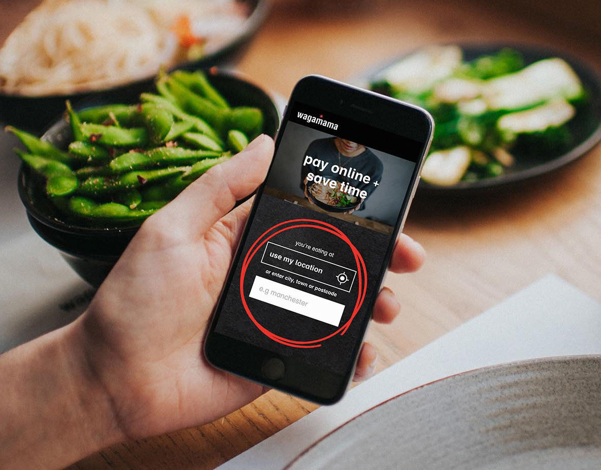
Problem
How can we improve the current product, especially on desktop, to be more intuitive, user friendly and to boost product awareness as well as improve the visual interface?
Make the menu categories visible at all times, clearly display select items and quantities, introduce upselling for new and popular products. Prepare the platform for future updates, and make it scalable and adaptable.
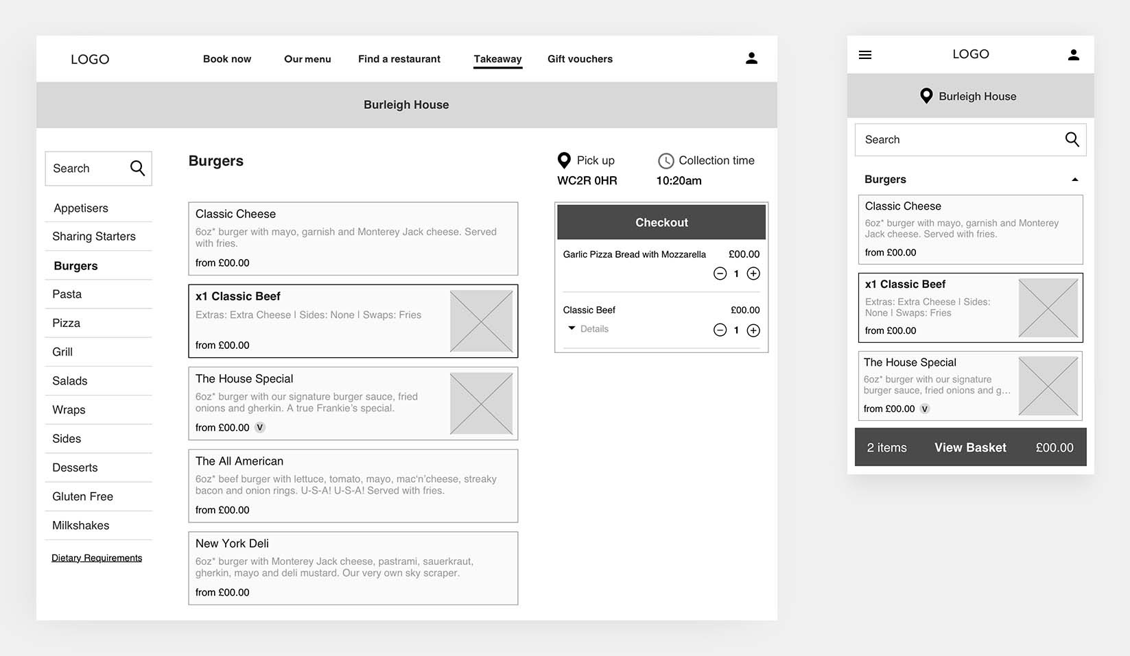
Low fidelity wireframes
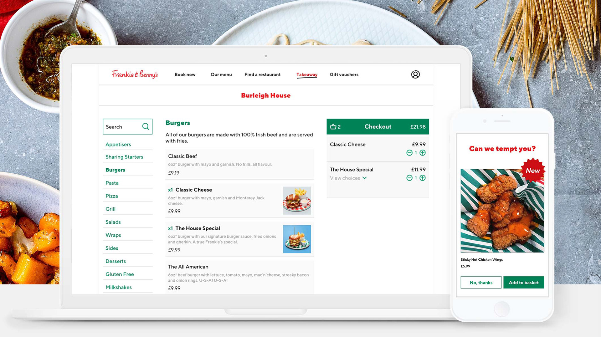
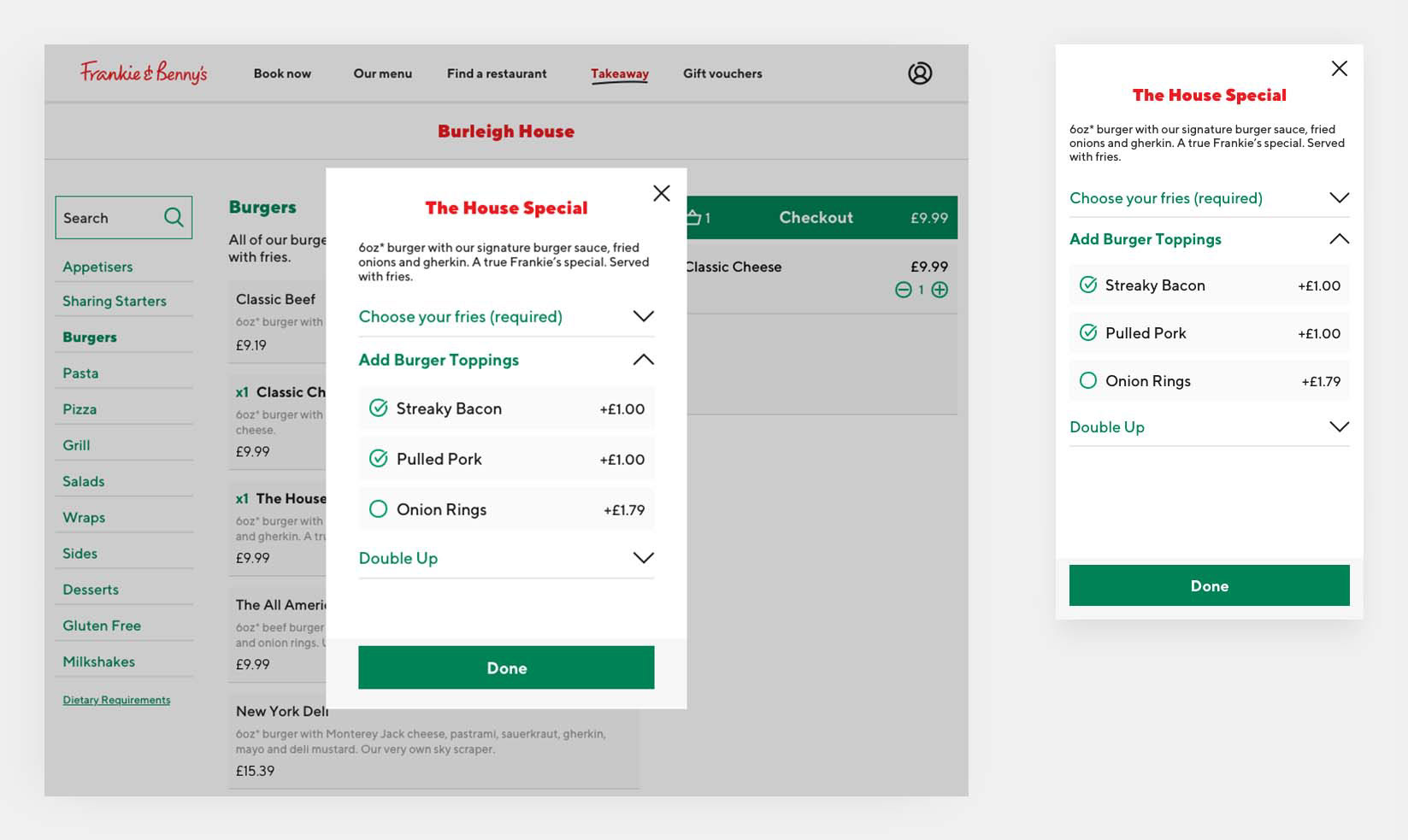
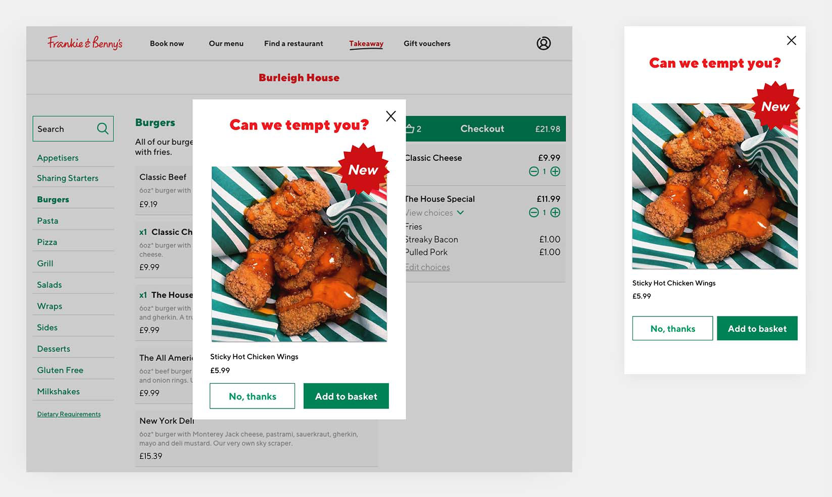
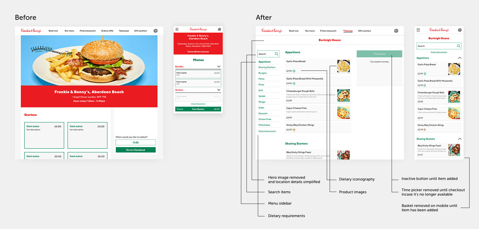
Aware of the time constraints of the project, and to maximise the product development, I repeatedly iterated the wireframes, focusing on enhancing the overall experience across the product, and improving the design with a new look and feel. I introduced new features such as the menu categories sidebar, visual cues for selected items, and easy-to-edit quantity functionality to improve the user experience and add value to the product. I also added an upselling modal to promote additional items that specifically accompanied the user’s basket.
The use of imagery changed from a hero image at the top of the page to photography for individual products to aid brand awareness and tempt users to increase the number of items added to the basket.
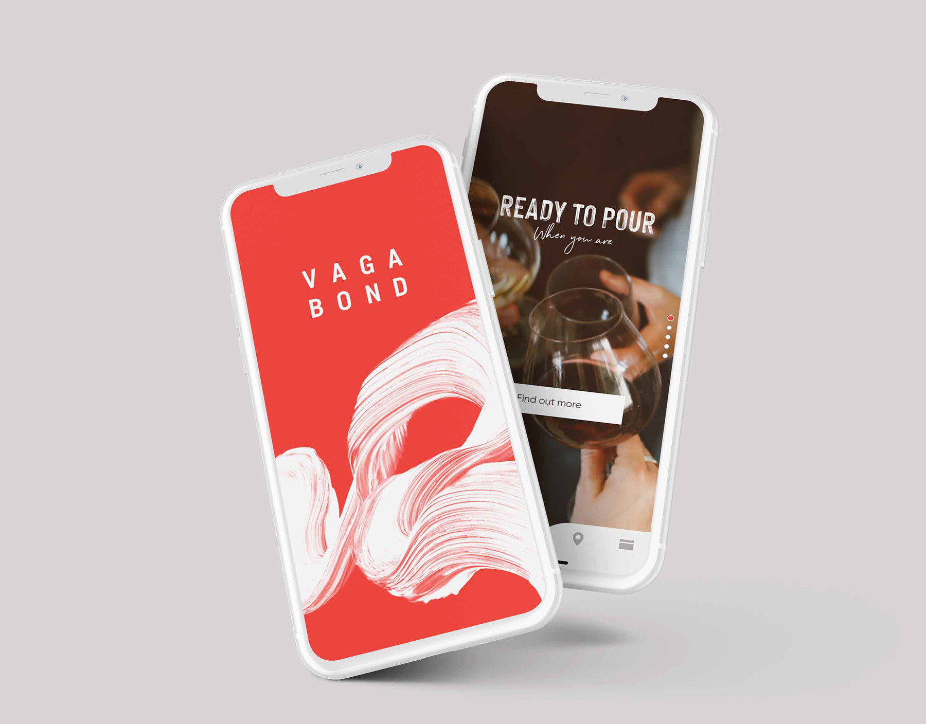
UI Designs
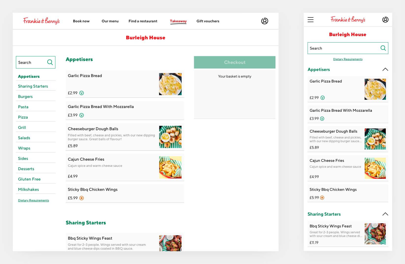
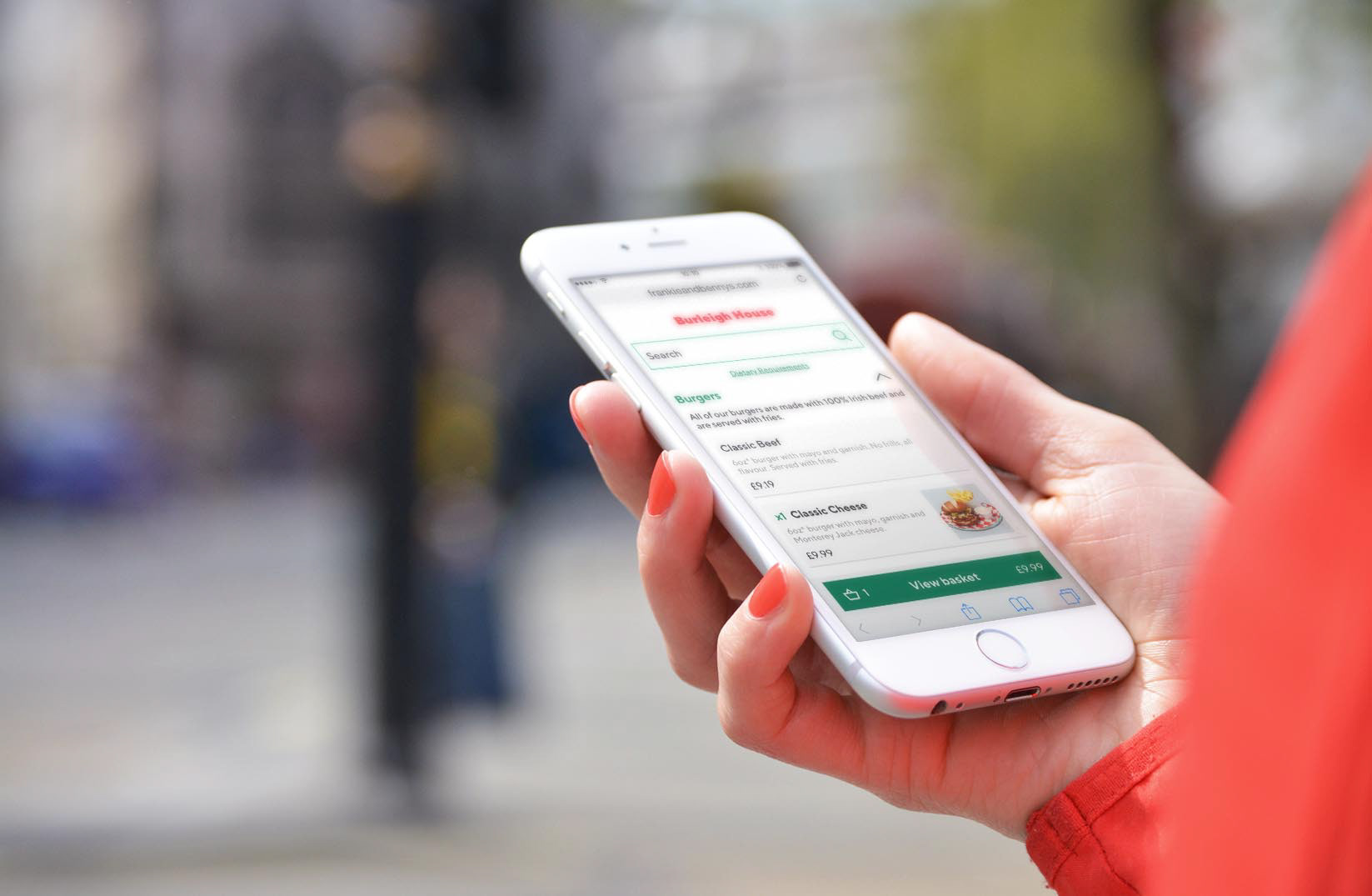
After introducing new features and refining the user experience, I produced high fidelity prototypes for mobile and desktop which were used for client review and testing. The design focused on a clean, user-friendly experience where users were asked to carry out tasks to establish the final design and visual aesthetics.
Frankie & Benny’s is upbeat, bright and family-friendly. All new design systems applied to Click & Collect were streamlined to be more inclusive, improve legibility and to reduce tension between the red and green colour palette. This meant the product was more subtle and elegant rather than brash.
Results & Learnings
After the redesign, Click & Collect was rolled out to more than 300 sites nationwide. It had increased engagement and interaction time which a weekly revenue increase of 60%. The upsell modal has 32% of guests converting and plays a huge part in increasing product awareness.
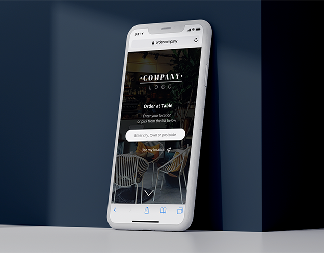
Due to its success the UX from Click & Collect I later adapted to form a whitelabel product, Order At Table. This is used by The Restaurant Group Concessions nationwide in London Heathrow airport, Glasgow airport and Manchester airport and or various other partnership.
“The results are fantastic and everyone here is mightily impressed.”
– David, Project Manager at The Restaurant Group